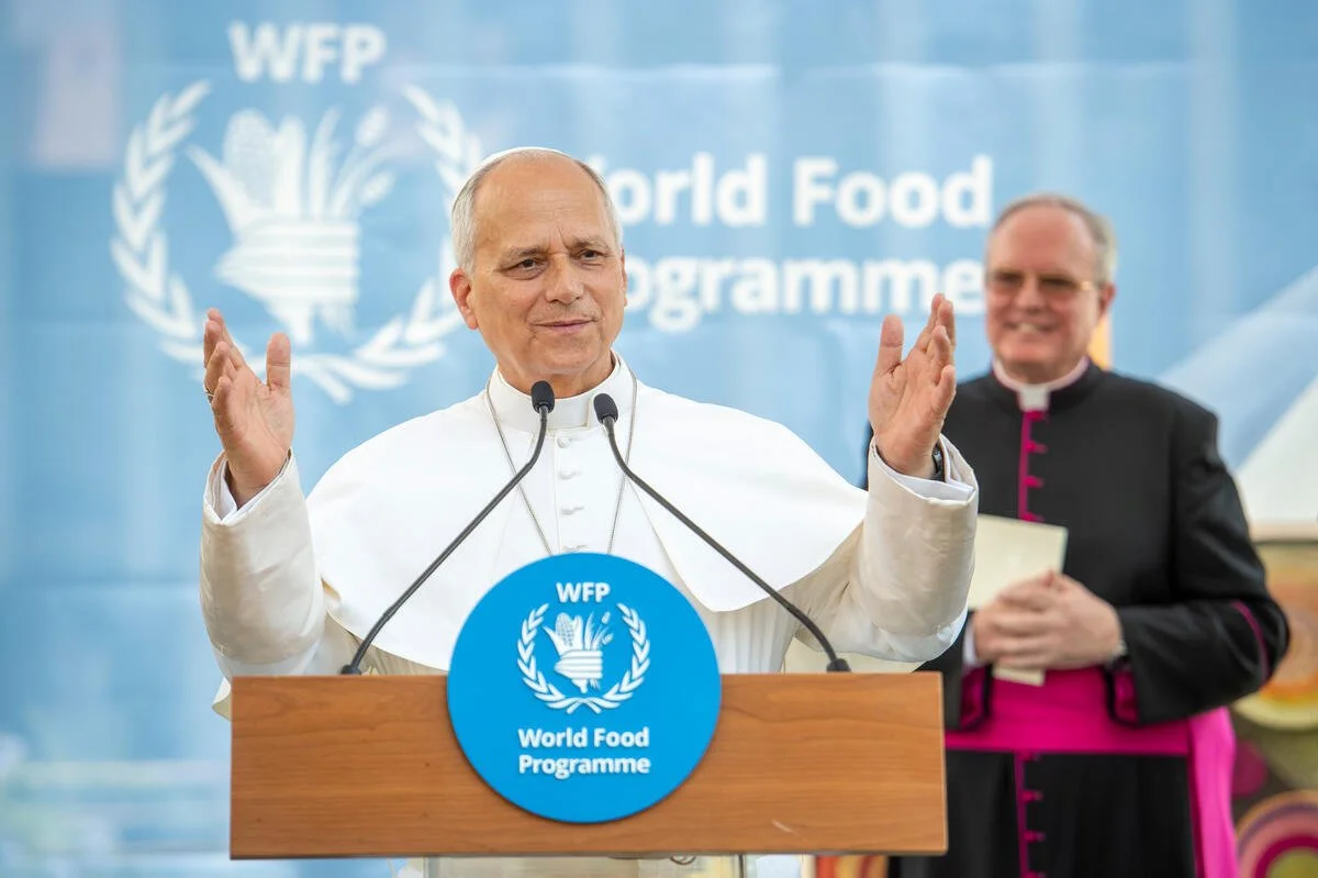
Papal Visit — Creating the Brand Experience
Brand Experience / Creative Direction / Messaging
Creating one look and feel across a major institutional moment.
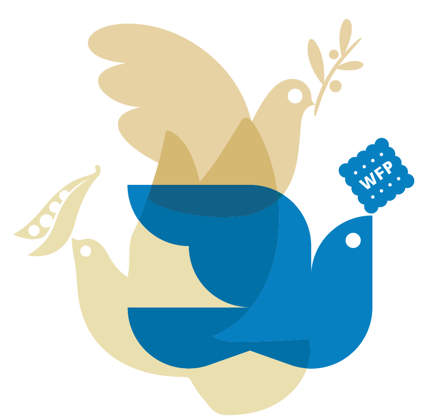
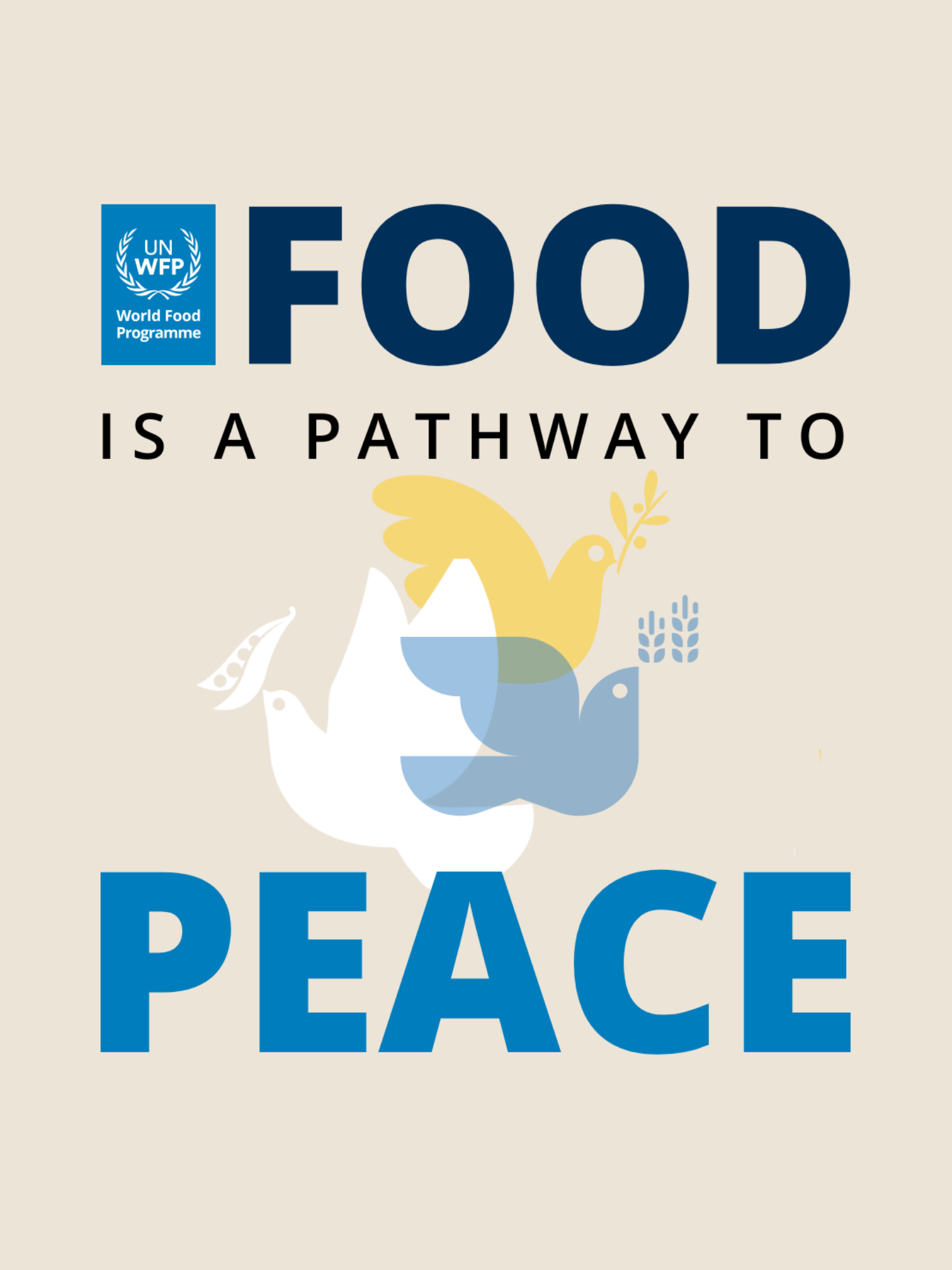
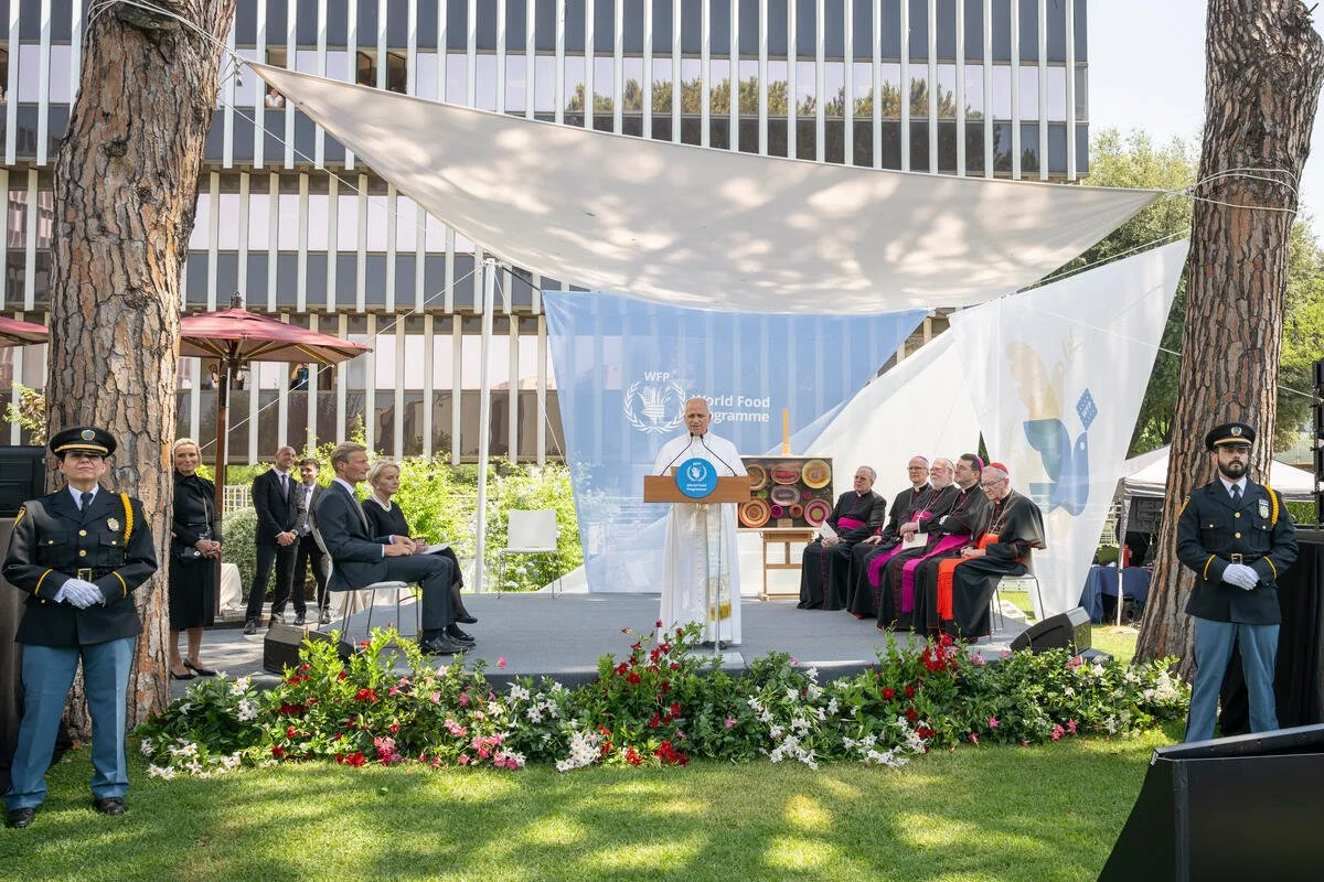
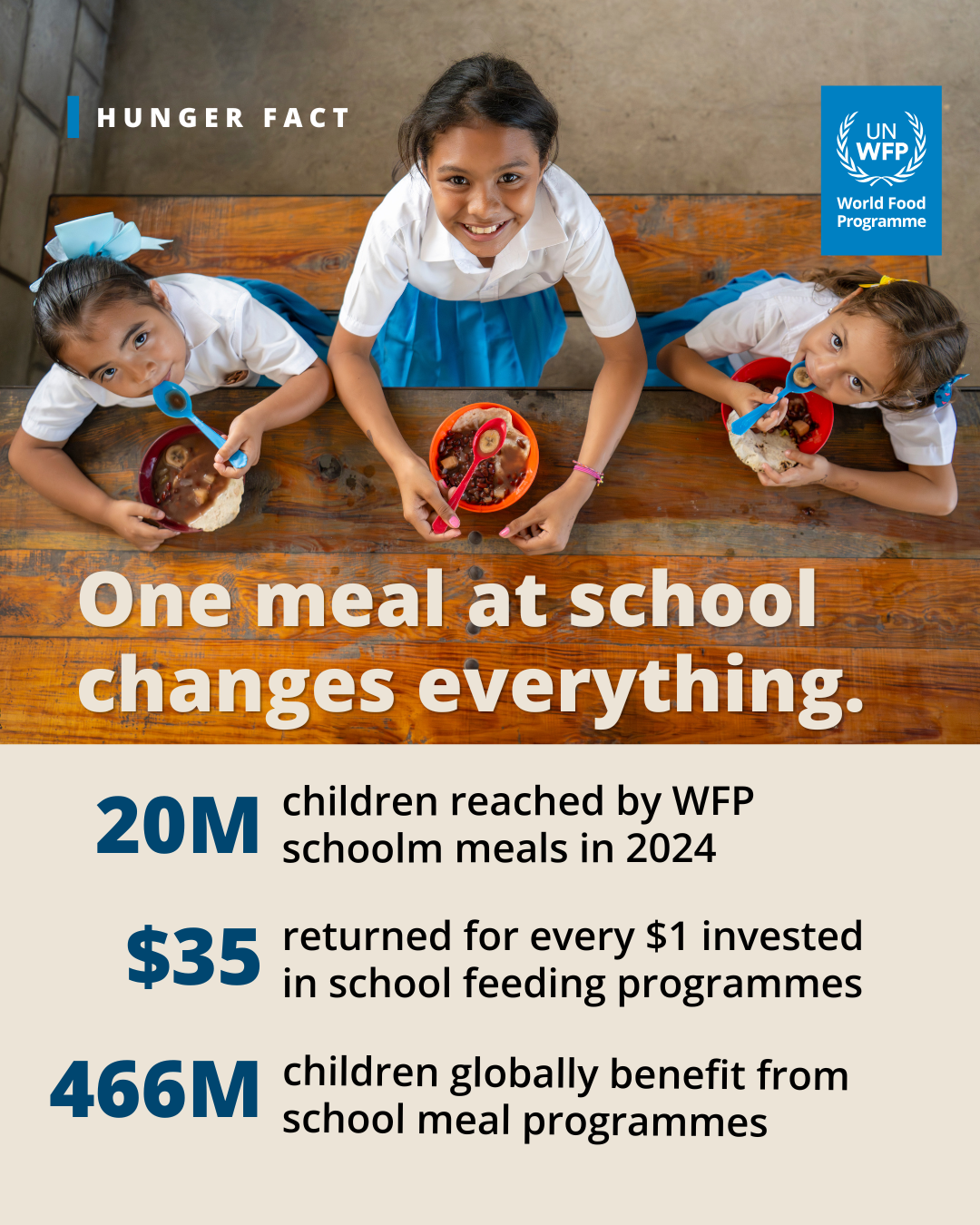
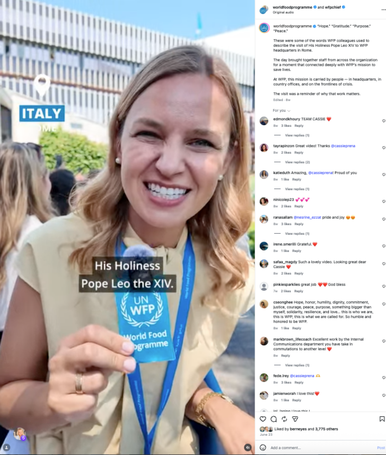
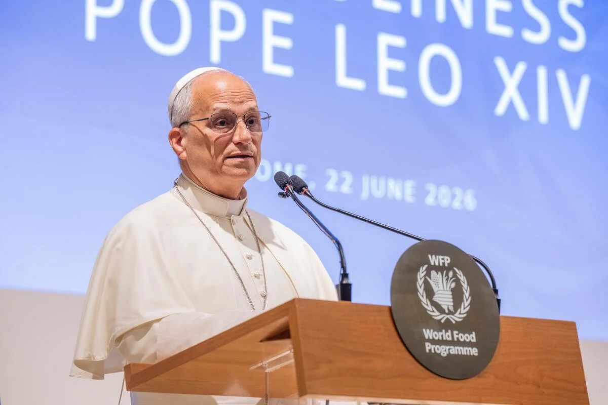
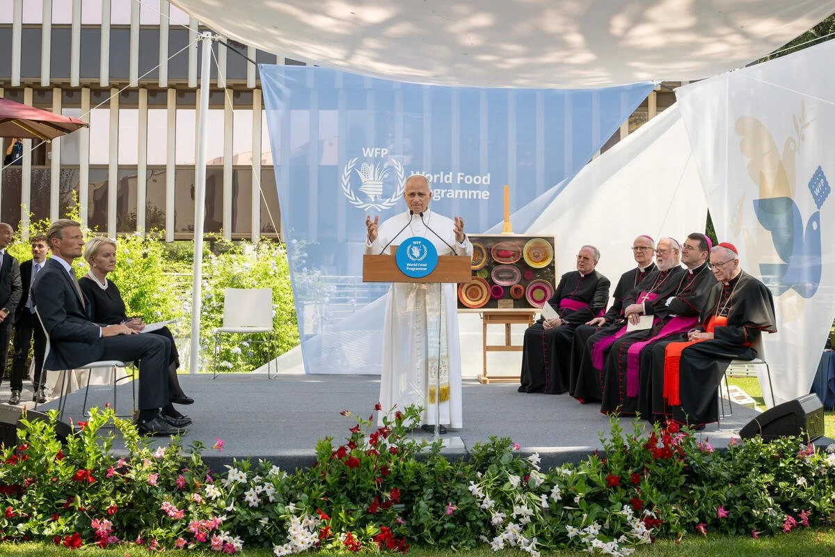
For the Papal Visit to WFP, I helped set the overall creative direction — developing a visual language that could work across digital products, social content, video, programmes, banners, the stage environment and physical installations.
The challenge was bringing many different elements and contributors together into one coherent experience, while keeping the humanitarian message at the centre — and while keeping high-stakes stakeholders happy.
01 / Setting the Creative Direction
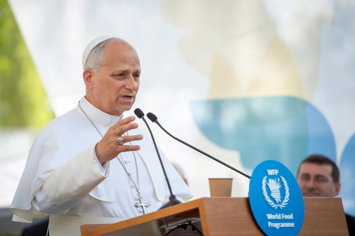
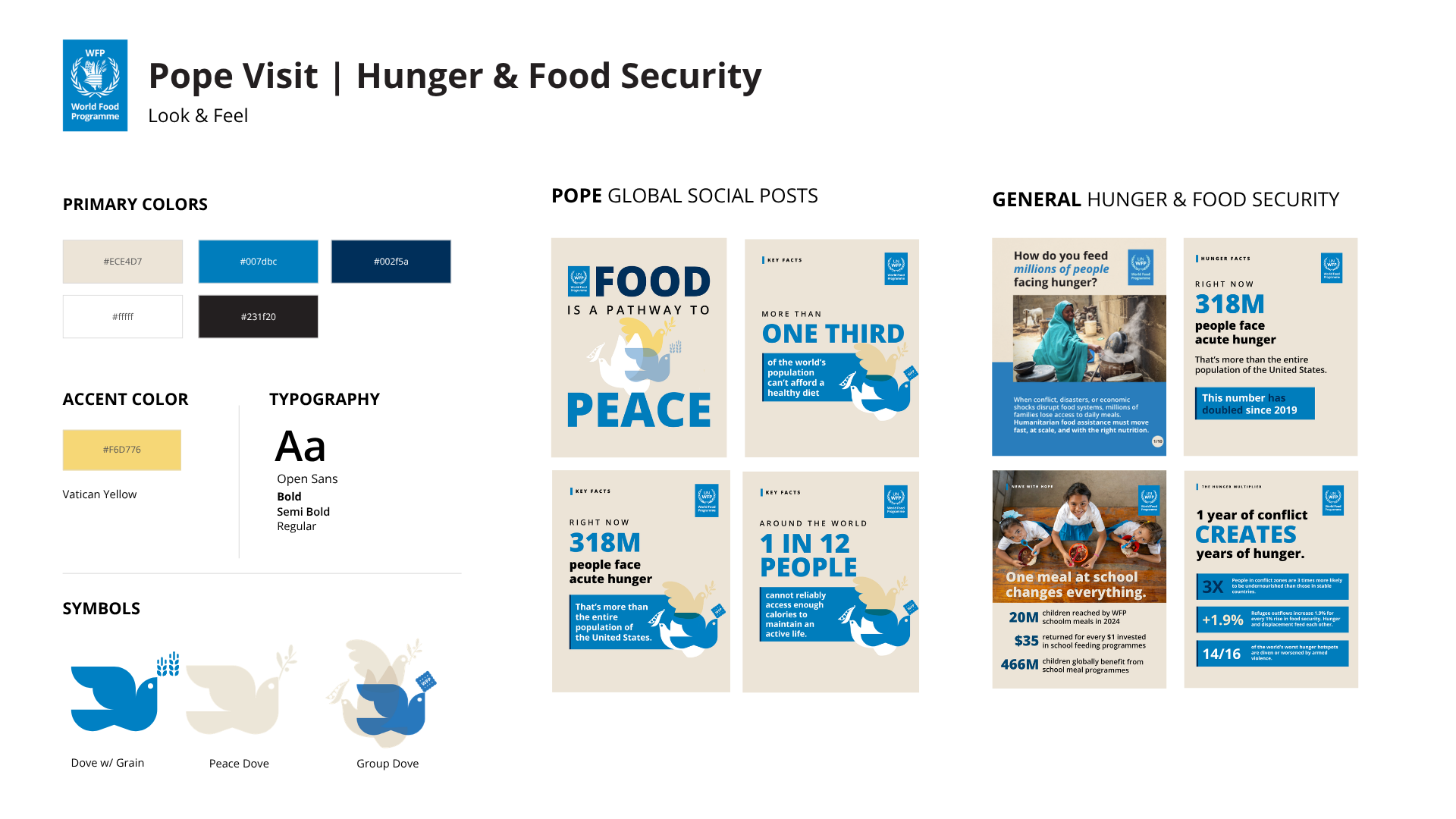
The first step was defining a look and feel that could hold the entire visit together.
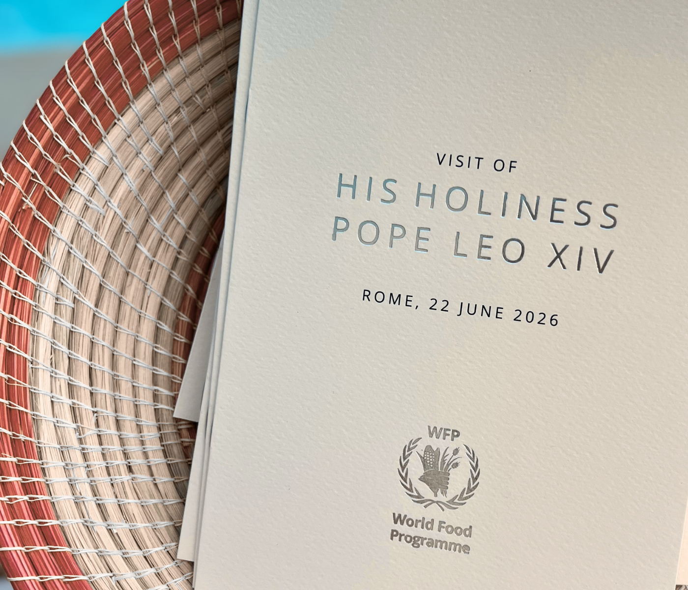
I helped shape the visual direction and carry it across very different formats — from screens and social assets to print, stage branding and environmental graphics — so each piece felt connected without simply repeating the same design.
02/ Bringing the Message into the Space
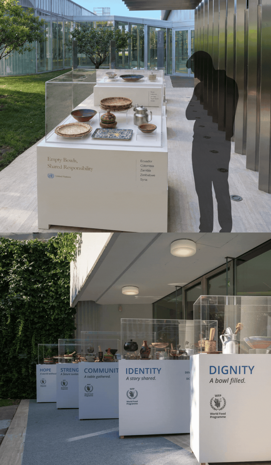
For the Empty Bowls installation, I developed the messaging and helped shape how the idea would live physically within the space.
The bowls became a simple visual expression of hunger, dignity and shared responsibility — with the copy and installation working together to give the message more emotional weight.
SELECTION OF INTRO COPYA Place at the Table.
Dignity. Identity. Hope.
A bowl is never just a bowl.
It carries food, memory, tradition and belonging.
Collected from communities where WFP works around the world, these bowls reflect the rich diversity of the people and cultures they represent.
Together they remind us that ending hunger is about more than providing food. It is about protecting dignity, preserving identity and creating hope.
Every person deserves a place at the table.
03 / From Concept to Reality
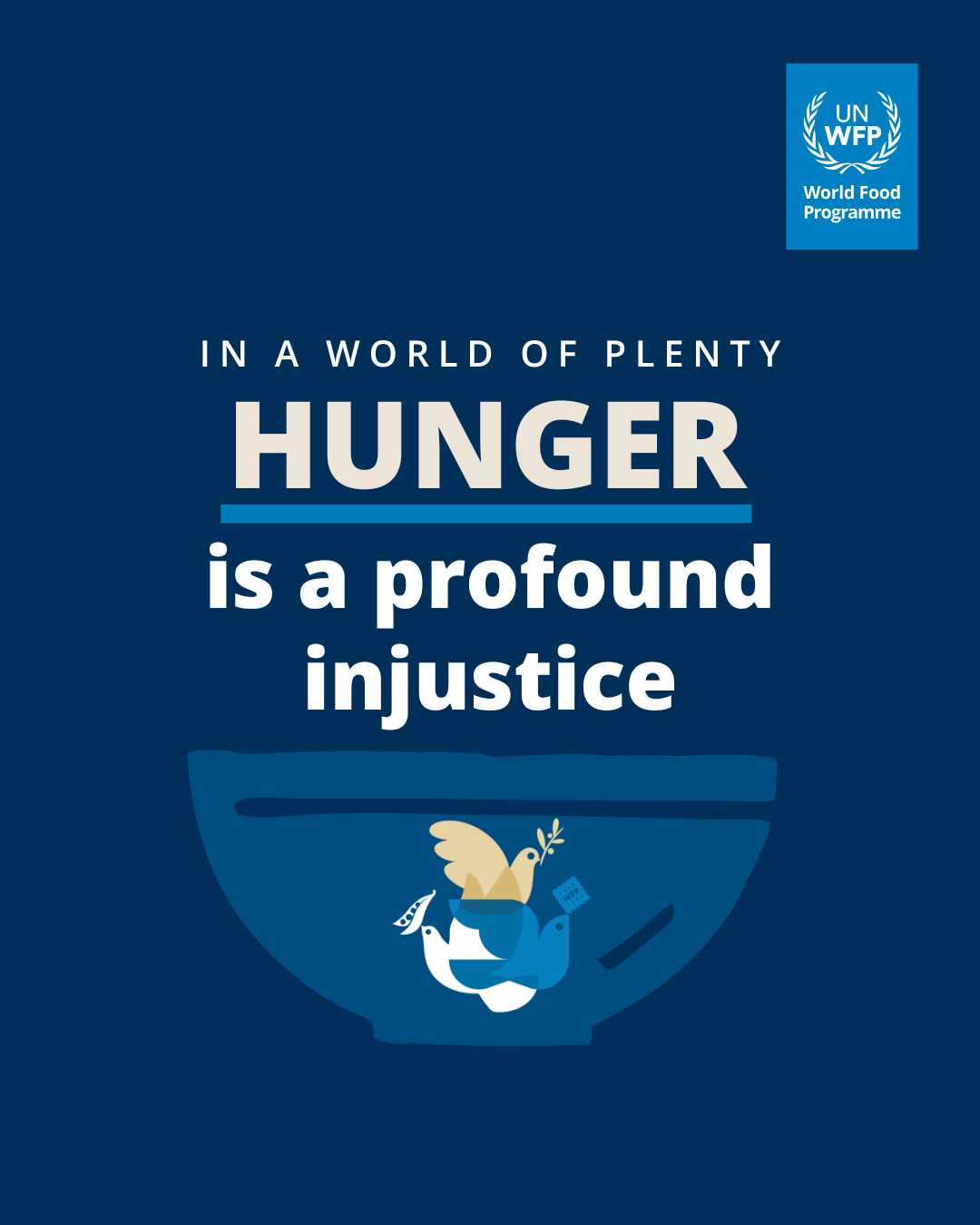
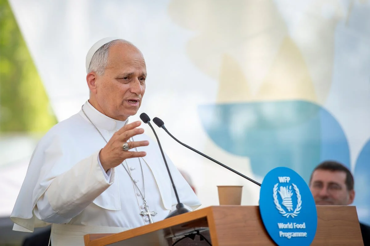
Many of the ideas needed to be understood and approved before they physically existed.
I used AI-assisted visual mock-ups and scripting to explore installations, signage and spatial ideas — making it easier for teams to see the concept, respond to it and refine it before production.
The value wasn’t AI for its own sake. It was being able to move much faster from an idea in someone’s head to something everyone could actually see and discuss.
04 / ACROSS THE EXPERIENCE
The creative direction extended across the full visit:
VISUAL IDENTITY
Look and feel across the event
DIGITAL + SOCIAL
Digital assets / social content / video / voiceover HERE
PHYSICAL BRANDING
Stage / banners / screens / programmes
MESSAGING + INSTALLATION
Environmental copy / installations / Empty Bowls